Monivea Road - Introduction Animation
The Project
Approached by Monivea Road, my role was to create a fun and friendly animation explaining their process and what benefits they offer to both doctors and patients.
An important feature we agreed on was to incorporate their new brand refresh subtly throughout the animation. We explored this through introducing some of the key design elements into the backgrounds, elements and characters that can be found throughout the video.
Client - Monivea Road
Creative Direction - Tom Ward & Cameron Pyke
Early Designs
The Characters
We looked into three different character styles for the animation. Playing with line weight, amount of detail and levels of simplification we came to the examples to the left.
‘01’ is simplified and stripped back in its design. ‘02’ is more friendly and cartoony, whilst ‘03.1’ and ‘03.2’ are more corporate. ‘01’ introduced the wave design in the bun which ended up being repurposed into another character later.
We landed on ‘02’, preferring the friendliness and thicker line weight (with a “Monivea loop de loop” in the hair for good measure).
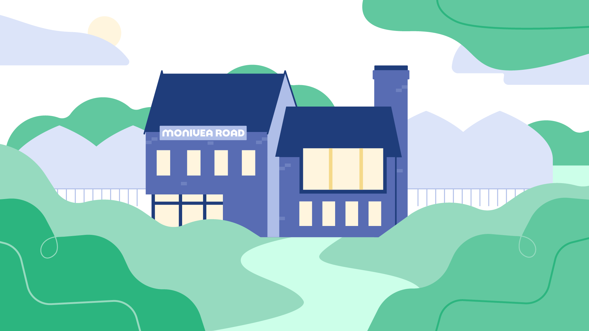
The House
The house was an important feature of the animation. We went through a few blocked out designs before landing on the final video design.


